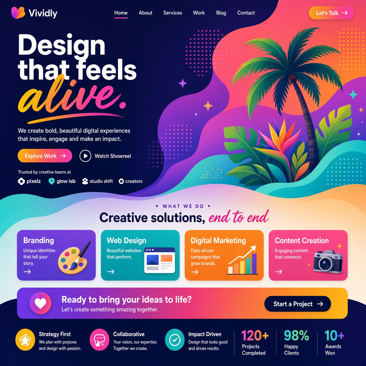
Color is one of the most powerful tools in a web designer's toolkit. It shapes first impressions, evokes emotion, reinforces branding, and guides user behavior — often before a visitor even reads a single word. Understanding color theory web design principles helps designers and business owners make informed, intentional choices rather than relying on guesswork. This beginner's guide breaks down the basics of color theory and how to apply them effectively to websites.
What Is Color Theory?
Color theory is the study of how colors interact, combine, and affect perception. It's built around the color wheel, a visual representation of colors arranged based on their relationships to one another. By understanding these relationships, designers can create color palettes that feel balanced, intentional, and visually appealing rather than random or jarring.
The Color Wheel Basics
The color wheel consists of primary colors (red, blue, yellow), secondary colors (created by mixing primaries, such as green, orange, and purple), and tertiary colors (mixes of primary and secondary colors). Understanding where colors sit on the wheel helps designers identify which combinations will work well together. Common Color Scheme.
Several standard color schemes are widely used in web design:
- Complementary colors sit opposite each other on the color wheel (like blue and orange) and create high contrast, making them ideal for calls-to-action.
- Analogous colors sit next to each other (like blue, teal, and green) and create a harmonious, cohesive look.
- Triadic colors are evenly spaced around the wheel (like red, yellow, and blue) and offer vibrant contrast while maintaining balance.
- Monochromatic schemes use different shades and tints of a single color, creating a clean, unified look.
The Psychology of Color
Colors carry psychological associations that influence how visitors feel about a website. Blue often conveys trust and professionalism, which is why it's common in finance and tech industries. Red can create urgency or excitement, often used in sales or calls-to-action. Green is associated with growth and health, while yellow conveys optimism and energy. Choosing colors that align with your brand's message and target audience is a key part of effective color theory web design.
Contrast and Readability
Beyond aesthetics, color plays a functional role in readability and accessibility. Text should have sufficient contrast against its background to be easily readable — dark text on a light background, or vice versa, generally works best. Poor contrast can make content difficult to read, particularly for visitors with visual impairments, so testing contrast ratios is an important step in the design process.
Using Color to Guide Attention
Strategic use of color can direct a visitor's eye toward important elements, such as buttons, forms, or key messages. A bright, contrasting color used sparingly for calls-to-action stands out against a more neutral overall palette, making it clear where visitors should focus their attention or take action. Building a Cohesive Palette
A strong website color palette typically includes a primary color, one or two secondary colors, and a neutral base (such as white, gray, or black) for backgrounds and text. Limiting the palette to a small number of well-chosen colors keeps a website looking clean and professional, while still allowing enough variation to create visual interest.
Final Thoughts
Color theory web design isn't about following rigid rules — it's about understanding the principles well enough to make confident, intentional choices. By considering color relationships, psychological associations, contrast, and consistency, designers can create websites that not only look visually appealing but also communicate the right message and guide users effectively toward their goals.