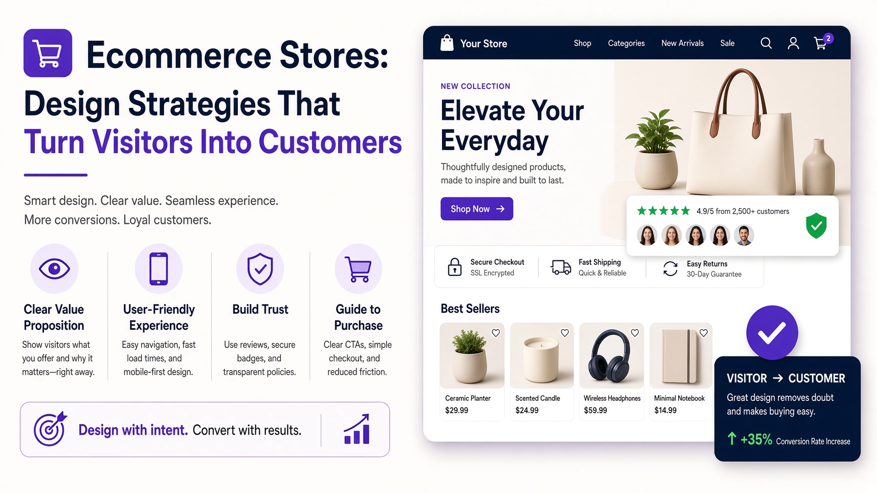
Ecommerce Stores: Design Strategies That Turn Visitors Into Customers
Successful Ecommerce Stores do more than display products. They guide customers through a carefully planned journey, answer important questions, establish trust, and make purchasing feel simple. While attractive visuals can create a positive first impression, effective ecommerce design must also support usability, accessibility, search visibility, and conversions.
Customers have thousands of online retailers competing for their attention. If a website feels confusing, loads slowly, or makes product information difficult to find, shoppers can leave within seconds. Businesses must therefore treat design as a commercial tool rather than decoration. Every page, image, button, and message should help visitors move confidently towards a purchase.
Start With a Clear Visual Identity
Strong Ecommerce Stores have a recognisable identity that remains consistent across the entire website. Colours, typography, photography, icons, and page layouts should reflect the personality of the brand while remaining easy to understand.
Consistency creates familiarity. When the homepage, product pages, shopping basket, and checkout use the same visual language, the experience feels professional and dependable. Inconsistent design can make customers wonder whether they have been redirected to another website or whether the business is trustworthy.
Brand identity should never reduce usability. Decorative fonts may look distinctive in a logo but become difficult to read in product descriptions. Bright colours can attract attention but should be used carefully, especially for buttons and important messages. A restrained design often gives products more space to stand out.
Make Navigation Simple and Predictable
Navigation is one of the most important features of Ecommerce Stores. Customers must be able to understand where they are, what products are available, and how to reach relevant categories without unnecessary effort.
Use clear category names based on the language customers naturally use. Creative labels may sound original, but familiar terms are usually more effective. A fashion retailer might organise products by clothing type, occasion, collection, or customer group. A technology store may prioritise device categories, brands, and specifications.
Large product catalogues can benefit from a well-structured menu, useful filters, breadcrumbs, and an accurate search function. Filters should reflect the information that influences purchasing decisions, such as size, colour, price, material, availability, or rating. Customers should also be able to remove filters easily and see how many products remain.
Design an Engaging Homepage
The homepage introduces the business and helps visitors decide what to explore. It should communicate the brand’s offer quickly, without overwhelming users with competing banners, pop-ups, and promotional messages.
An effective homepage normally includes a clear headline, a concise value proposition, featured categories, selected products, and a strong call to action. Seasonal promotions and new collections can also appear, but the hierarchy should remain obvious.
Avoid filling the top of the page with a large image that provides little useful information. Customers should immediately understand what the store sells and why they should continue browsing. Ecommerce Stores with several customer groups can use homepage sections to direct each audience towards the most relevant products.
Social proof, customer benefits, and service information can strengthen the page. However, every element must have a purpose. Removing unnecessary content often creates a clearer and more persuasive experience.
Create Product Pages That Answer Questions
Product pages have a direct influence on purchasing decisions. Because customers cannot physically examine an item, the page must provide enough detail to reduce uncertainty.
Use high-quality photographs showing multiple angles, important details, scale, and realistic use. Zoom functionality can help shoppers inspect materials and finishes. Where appropriate, video can demonstrate movement, installation, features, or results.
Descriptions should explain what the product is, who it is for, and why it is useful. Combine concise benefit-focused copy with scannable specifications. Include essential information about dimensions, materials, compatibility, care, delivery, stock, and returns.
The primary call to action must be easy to find and clearly labelled. Options such as size or colour should appear before the purchase button, with unavailable choices identified immediately. Well-designed Ecommerce Stores also display related products without distracting customers from the item they are considering.
Build Trust Throughout the Experience
Customers need confidence before sharing personal and payment information. Trust should be reinforced throughout the website rather than introduced only during checkout.
Display accurate contact information, delivery details, return conditions, and secure-payment messaging in appropriate locations. Policies should use straightforward language and be easy to access. Hidden costs or unclear conditions can cause customers to abandon a purchase.
Verified reviews provide valuable social proof, particularly when they include useful comments, customer photographs, or information about fit and quality. Testimonials and recognised payment options can provide additional reassurance.
Businesses should avoid using excessive badges or unsupported claims. Trust comes from transparency, consistency, and reliable information. A polished website will not compensate for vague policies or unrealistic promises.
Prioritise Mobile Ecommerce Design
Many customers discover and purchase products using smartphones. Ecommerce Stores must therefore offer a complete mobile experience rather than a reduced version of the desktop website.
Mobile layouts should use readable text, touch-friendly controls, concise menus, and appropriately sized images. Important actions should not sit too close together, and customers should never need to zoom in to complete a task.
Product filters can appear in a collapsible panel to preserve screen space. Purchase buttons may remain visible as customers scroll, provided they do not cover important content. Forms should request only essential information and use suitable mobile keyboard settings for email addresses, telephone numbers, and payment details.
Testing must take place on different screen sizes and devices. A design that looks correct in a prototype may behave differently when customers encounter long product names, error messages, or multiple promotional offers.
Improve Website Speed
Performance is part of design. Large images, unnecessary scripts, complicated animations, and poorly configured applications can make Ecommerce Stores slow and frustrating.
Optimise images for their displayed dimensions and use modern formats where appropriate. Load off-screen content only when needed, minimise unnecessary third-party tools, and prioritise the elements customers see first. Animation should support communication rather than delay access to products.
Speed should be monitored across product, category, basket, and checkout pages. Mobile performance deserves particular attention because customers may be using slower connections. Faster experiences improve usability and can also support stronger search-engine performance.
Simplify the Checkout Process
A customer who reaches checkout has shown clear purchasing intent. The design should remove obstacles and help them complete the transaction efficiently.
Allow guest checkout instead of forcing account creation. Show progress clearly, keep forms concise, and explain errors beside the relevant fields. Customers should be able to review products, quantities, delivery charges, and the final total before paying.
Offer appropriate payment methods and avoid introducing unexpected fees at the final stage. Address lookup, autofill, and sensible default settings can reduce effort. Account creation can be offered after purchase, when the customer already understands its benefits.
Basket contents should remain saved if someone leaves temporarily. Effective Ecommerce Stores also send clear confirmation messages explaining what happens next.
Support Accessibility and Inclusive Shopping
Accessible design allows more people to browse and purchase independently. Use sufficient colour contrast, descriptive links, meaningful alternative text, keyboard-friendly navigation, and visible focus indicators.
Form fields need clear labels, while errors should not rely on colour alone. Product information should remain understandable for customers using assistive technology. Video content should include captions when speech or sound communicates important details.
Accessibility benefits every customer. Clearer content, larger controls, logical headings, and predictable navigation improve the overall experience while helping businesses reach a wider audience.
Test and Continuously Improve
Ecommerce design is never permanently finished. Customer expectations, product ranges, devices, and business priorities change over time. Analytics can reveal where visitors leave, what they search for, and which pages create friction.
Combine quantitative data with customer feedback, usability testing, support enquiries, and session observations. Test meaningful changes to navigation, product information, calls to action, and checkout steps. Avoid changing several major elements simultaneously if doing so makes results difficult to interpret.
The best Ecommerce Stores balance brand expression with customer needs. By simplifying navigation, strengthening product pages, improving mobile performance, building trust, and refining checkout, businesses can create shopping experiences that feel effortless. Thoughtful design does not simply make an online store look better; it gives customers the clarity and confidence required to purchase and return.