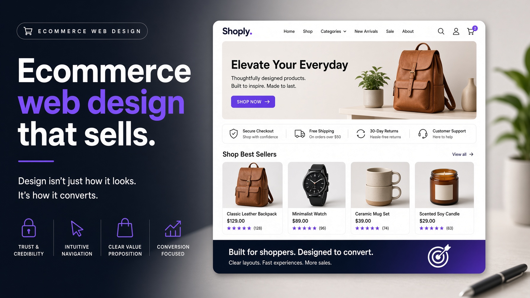
An Ecommerce Website has to do more than display products attractively. It must help shoppers find the right item, understand its value, trust the business and complete a purchase with as little friction as possible. Every design decision — from navigation and product photography to delivery information and checkout — influences whether a visitor continues shopping or abandons the journey. This guide explains the foundations of an online store that is clear, credible and built around customer needs.
Start with customer intent
People arrive at an online store with different levels of certainty. Some know the exact product they want, while others are comparing options or still defining their problem. Your Ecommerce Website should support all three groups. Clear categories help purposeful shoppers navigate quickly, while search, buying guides, comparison tools and useful filters help less certain visitors make progress. Organise products according to the way customers think, not necessarily the way the business is structured internally. Use familiar category names, explain specialist terms and make important differences easy to compare.
Create navigation that supports discovery
Good ecommerce website designed navigation is visible, predictable and forgiving. Use a clear category hierarchy, descriptive labels and search that accommodates variations in wording. Filters should reflect meaningful buying decisions such as size, price, compatibility, colour or availability. On mobile, make filters easy to open, apply and clear without forcing shoppers to restart their search. Include breadcrumbs where they help people understand their position, particularly in stores with many categories. A shopper should be able to move from a product to its category, then refine the results without losing context.
Design product pages for confident decisions
A product page should answer the questions that stand between interest and purchase. Show clear imagery from useful angles, provide concise benefits as well as specifications, and make price, availability, delivery and returns easy to find. If a product has options, make selections obvious and show how the choice affects price or stock. Reviews, ratings, demonstrations, size guidance and compatibility information can reduce uncertainty. Present them in a readable order rather than hiding all useful detail below an oversized image. The right balance is not maximum content; it is the information a shopper needs at the moment of decision.
Build trust into the interface
Trust is created through many small signals. Consistent branding, professional photography, transparent pricing, recognisable payment options, clear contact details and straightforward policies all contribute. Avoid surprising customers with costs or conditions late in the journey. If delivery charges depend on location, explain that early and make the next step clear. Social proof is most persuasive when it is specific and relevant. Reviews that mention fit, durability, delivery or use cases give shoppers more value than generic praise.
Make the cart and checkout frictionless
The checkout should ask only for information that is necessary. Use clear labels, helpful validation and an obvious summary of products, delivery and total cost. Allow customers to review or change choices without losing their progress. Guest checkout can be valuable for first-time shoppers who are not ready to create an account. Mobile checkout deserves particular attention. Use appropriate keyboard types, large controls and payment methods that reduce manual entry. Every extra field or confusing message is an opportunity for abandonment, so test the journey with people who did not design it.
Design for performance and accessibility
Large product imagery is essential, but it must be optimised so it does not slow the store. Use appropriately sized files, lazy-load content where suitable and keep scripts purposeful. Fast pages support both user satisfaction and discoverability. Accessibility should be part of the Ecommerce Website design process. Provide useful alternative text, sufficient contrast, keyboard access, visible focus states and clear error messages. Inclusive design expands the number of people who can shop independently and often improves usability for everyone.
Measure and improve the experience
Track meaningful stages such as search usage, product views, add-to-cart actions, checkout progression and completed orders. Combine quantitative data with customer questions, support conversations and usability testing. A low conversion rate may reflect unclear product information, unexpected delivery costs, poor mobile interaction or a mismatch between marketing and landing-page content. Treat the store as an evolving system. Test one meaningful improvement at a time, document what changed and judge success against a defined customer or business outcome.
Final thoughts
Effective Ecommerce Website design combines visual appeal with reassurance, speed and clarity. When shoppers can discover products easily, understand their options and complete a purchase without surprises, design becomes a practical driver of commercial performance rather than decoration around a catalogue.