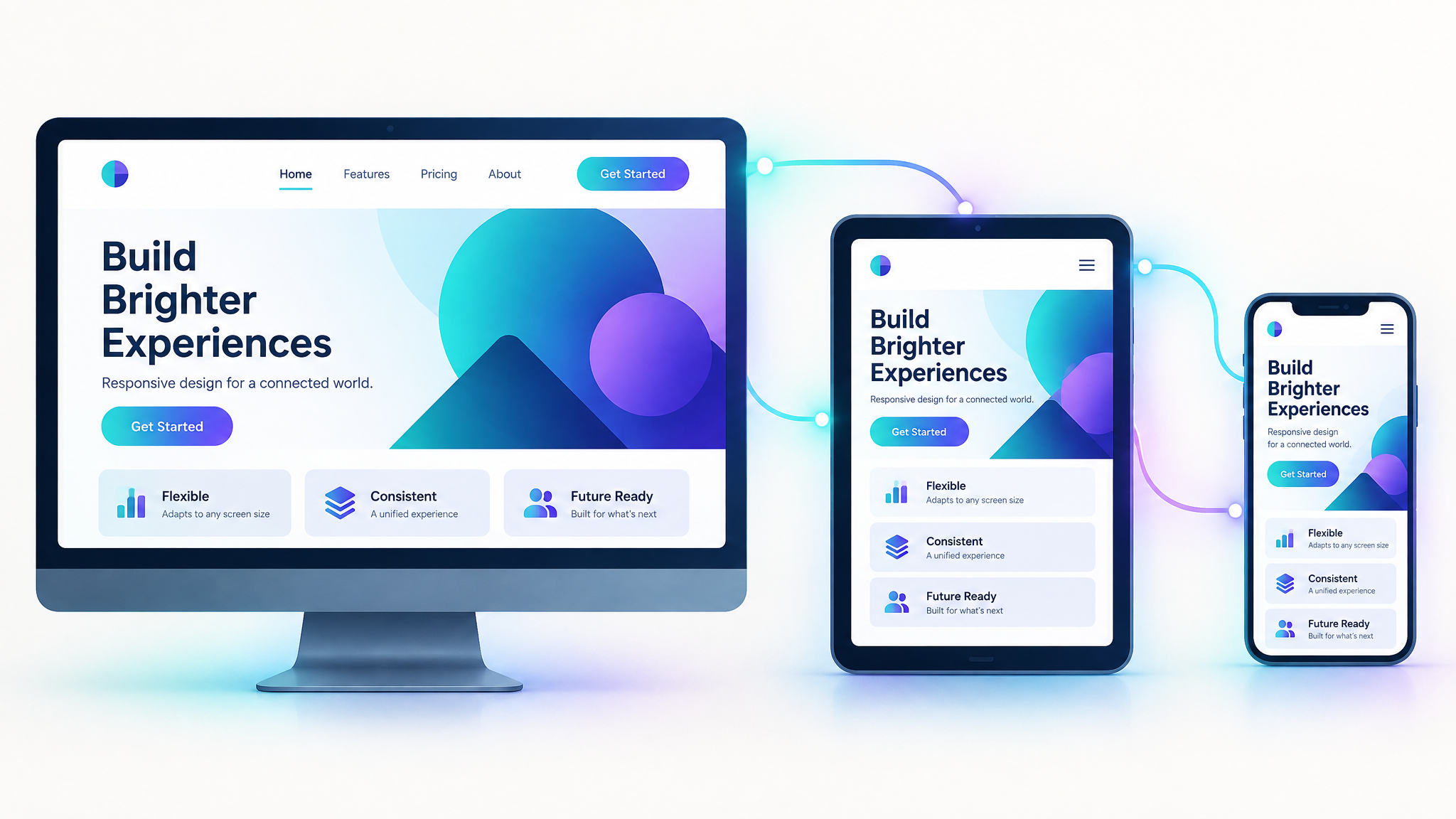
How to Create a Responsive Website: Step-by-Step Guide
With more than half of all web traffic now coming from mobile devices, having a responsive website design is no longer optional — it's essential. A responsive website automatically adjusts its layout, images, and content to fit any screen size, from a large desktop monitor to a small smartphone. This step-by-step guide walks through the key principles and practical steps involved in creating a responsive website that performs well across all devices.
What Is Responsive Website Design?
Responsive website design is an approach to building websites that ensures they display and function properly across a range of devices and screen sizes. Rather than creating separate versions of a site for desktop and mobile, responsive design uses flexible layouts, images, and code that adapt automatically based on the visitor's screen size and orientation.
Step 1: Start with a Mobile-First Mindset
Designing with a mobile-first approach means building the layout for the smallest screen first, then progressively enhancing it for larger screens. This ensures the most essential content and functionality are prioritized, rather than cramming a desktop-designed layout into a small screen as an afterthought.
Step 2: Use a Flexible Grid Layout
Instead of fixed pixel widths, responsive websites use flexible grids based on percentages or relative units. This allows page elements to resize proportionally as the screen size changes, keeping the layout balanced and readable regardless of device.
Step 3: Implement Media Queries
Media queries are a core CSS technique that allow different styles to be applied based on screen size, resolution, or orientation. For example, a three-column layout on desktop might collapse into a single column on mobile. Setting clear breakpoints — the screen widths at which the layout changes — is a key part of building a responsive website.
Step 4: Optimize Images for Different Screens
Large images can slow down load times, especially on mobile devices with slower connections. Using responsive image techniques — such as serving different image sizes based on device, or using scalable vector graphics where appropriate — helps maintain visual quality without sacrificing performance.
Step 5: Prioritize Touch-Friendly Navigation
On mobile devices, navigation needs to accommodate touch interaction rather than mouse clicks. This means larger tap targets for buttons and links, simplified menus (often collapsed into a hamburger menu), and enough spacing between clickable elements to prevent accidental taps.
Step 6: Test Across Multiple Devices
Once a responsive layout is built, it's essential to test it across a range of real devices and screen sizes — not just by resizing a browser window. Testing helps catch issues like overlapping text, broken layouts, or images that don't scale properly, ensuring a consistent experience for every visitor.
Step 7: Monitor Performance
Responsive design isn't just about layout — it also affects load speed and performance. Regularly monitoring page speed on both desktop and mobile, and optimizing accordingly, ensures the site remains fast and user-friendly as content and features are added over time.
Final Thoughts
Building a responsive website design requires thinking beyond a single screen size and designing for flexibility from the start. By following a mobile-first approach, using flexible grids and media queries, optimizing images, and testing thoroughly across devices, you can create a website that delivers a smooth, consistent experience for every visitor — regardless of what device they're using.