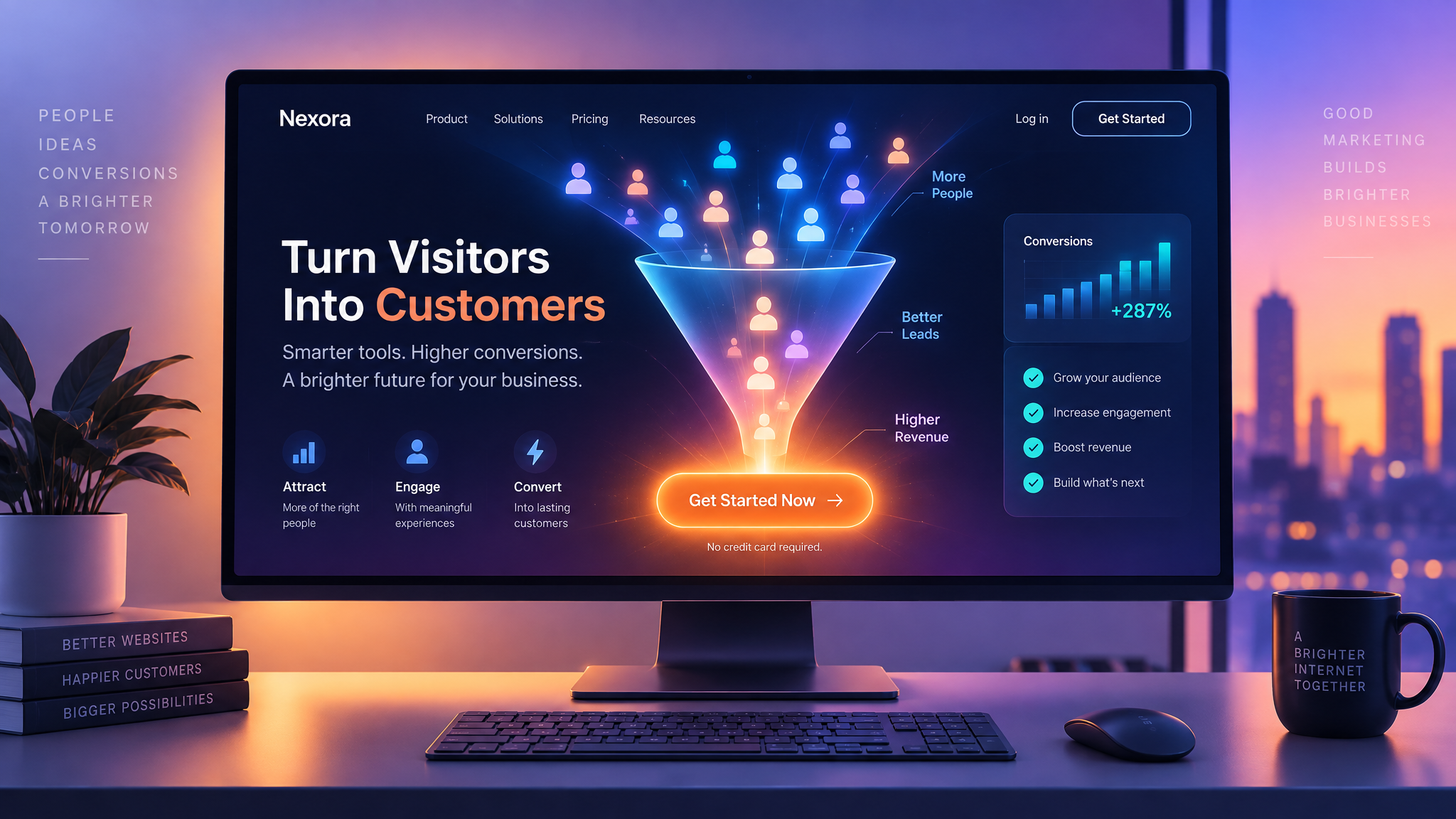
Your homepage is often the first — and sometimes only — chance to make a strong impression on a visitor. Within seconds, users decide whether to stay and explore or leave and look elsewhere. That's why understanding key homepage design tips is essential for turning casual visitors into leads or customers. This article covers practical strategies for designing a homepage that not only looks great but is also structured to convert.
Lead with a Clear Value Proposition
The moment a visitor lands on your homepage, they should immediately understand what your business does and why it matters to them. A clear, concise headline paired with a short supporting statement helps communicate your value proposition instantly, without forcing visitors to scroll or search for answers.
Design an Effective Hero Section
The hero section — the large, prominent area at the top of the homepage — sets the tone for the entire site. It typically includes a headline, supporting text, a strong visual (such as an image or short video), and a primary call-to-action. A well-designed hero section immediately signals professionalism and guides visitors toward the next step.
Prioritize a Strong Call-to-Action
Every homepage should have a clear, prominent call-to-action — whether that's "Get a Quote," "Shop Now," or "Sign Up." The button should stand out visually through color and placement, and the language should be direct and action-oriented. Avoid overwhelming visitors with too many competing calls-to-action; focus on one primary goal per page.
Use Visual Hierarchy to Guide the Eye
Effective homepage design tips often emphasize the importance of visual hierarchy — using size, color, and spacing to guide visitors through the page in a logical order. Important information and actions should be visually prioritized, while secondary content supports the main message without competing for attention.
Build Trust with Social Proof
Testimonials, client logos, reviews, or case studies placed on the homepage help build credibility and trust. Visitors are more likely to engage with a business that others have already had a positive experience with, making social proof a powerful conversion tool.
Keep Navigation Simple and Clear
A cluttered or confusing navigation menu can cause visitors to leave before finding what they need. Keeping the main navigation simple, with clear labels for key sections (such as Services, About, and Contact), helps visitors quickly find relevant information without frustration.
Optimize for Mobile Visitors
Since a significant portion of homepage visits come from mobile devices, it's essential that the layout, text size, and call-to-action buttons work well on smaller screens. A homepage that looks great on desktop but is difficult to use on mobile will lose potential conversions.
A slow-loading homepage can cause visitors to abandon the page before it even fully loads. Optimizing images, minimizing unnecessary scripts, and choosing reliable hosting all contribute to faster load times, which directly supports better conversion rates. Sometimes its better to have less imaes and videos, building web design.
Test and Refine
Even a well-designed homepage benefits from ongoing testing. Tools like heatmaps and A/B testing can reveal how visitors actually interact with the page, highlighting opportunities to adjust headlines, button placement, or layout to further improve conversions over time.
Final Thoughts
Designing a homepage that converts requires more than good aesthetics — it demands a clear understanding of your visitors' needs and a strategic layout that guides them toward action. By applying these homepage design tips — from a strong value proposition to clear calls-to-action and mobile optimization — you can create a homepage that not only looks professional but actively drives results for your business.