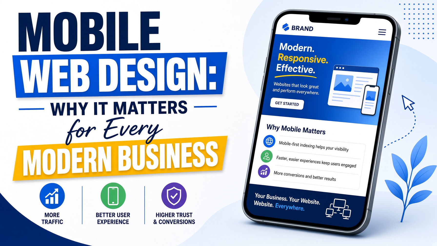
Mobile web design is no longer optional. In today’s digital world, most people browse websites on smartphones and tablets before they ever use a desktop computer. Whether they are searching for a nearby restaurant, a local service provider, an online shop, or a professional company, users expect a website to load quickly, look good, and work smoothly on any mobile device. This is why mobile-friendly web design has become one of the most important parts of building a successful online presence.
For businesses of all sizes, especially local businesses, having a mobile-optimised website can make the difference between gaining a customer and losing one. A website that is difficult to use on a phone can frustrate visitors, increase bounce rates, and reduce enquiries or sales. On the other hand, a well-planned mobile web design helps users find what they need quickly, builds trust, and encourages them to take action.
What Is Mobile Web Design? Mobile web design is the process of creating websites that work effectively on smaller screens, such as smartphones and tablets. It focuses on layout, speed, usability, navigation, readability, and functionality. A mobile-friendly website automatically adjusts to different screen sizes, making sure that content, images, buttons, and menus are easy to view and use.
Modern web design usually follows a responsive design approach. This means the website responds to the device being used. Instead of creating separate websites for desktop and mobile users, responsive web design allows one website to adapt naturally across all screen sizes. This improves consistency, saves time, and creates a better experience for every visitor.
Good mobile web design is not just about shrinking a desktop website to fit a smaller screen. It involves carefully thinking about how mobile users behave. People on mobile devices often want quick answers, simple navigation, fast loading pages, and clear calls to action. A strong mobile website should make it easy for users to call, book, buy, request a quote, or get directions.
Why Mobile Web Design Is Important The way people use the internet has changed dramatically. Mobile devices are now the first choice for browsing, shopping, researching, and contacting businesses. If your website does not perform well on mobile, you may be missing out on a large number of potential customers.
One of the biggest reasons mobile web design matters is user experience. Visitors expect a website to be simple and convenient. If text is too small, buttons are hard to tap, or pages take too long to load, users are likely to leave and choose a competitor instead. A mobile-friendly website keeps visitors engaged and helps them move through your site with less effort.
Mobile web design also affects search engine optimisation. Search engines want to provide users with the best possible results, and mobile usability is an important ranking factor. A website that is responsive, fast, and easy to use can perform better in search results than a site that is outdated or difficult to navigate on mobile devices. For businesses investing in web design, mobile optimisation should be part of the strategy from the beginning.
For companies that rely on customers in a specific area, local web design is especially important. Many mobile searches have local intent. People search for services “near me” or look for businesses in their town, city, or region. If your website is designed properly for mobile users, it becomes easier for local customers to find your business, contact you, and visit your location.
The Link Between Mobile Web Design and Local Web Design Local web design focuses on creating websites that help businesses connect with customers in their local area. This includes clear contact details, location information, service area pages, local keywords, Google Maps integration, customer reviews, and strong calls to action.
Mobile web design supports local web design because many local searches happen on mobile devices. For example, someone looking for a plumber, hair salon, café, accountant, builder, or dental clinic may search from their phone while they are ready to make a decision. If your website is easy to use, loads quickly, and clearly shows your phone number or booking form, you are more likely to turn that visitor into a customer.
A strong local web design strategy should include mobile-first thinking. This means designing the mobile version of the website as a priority rather than treating it as an afterthought. Since local customers often want fast information, your mobile site should answer key questions immediately. What do you offer? Where are you located? How can someone contact you? Why should they choose your business?
Including local trust signals is also important. Testimonials, local case studies, nearby service areas, awards, accreditations, and real images can help build credibility. When combined with professional mobile web design, these elements make your business appear more reliable and approachable.
Key Features of Effective Mobile Web Design A successful mobile website needs more than a responsive layout. It should be built around the needs of the user and the goals of the business. One of the most important features is fast loading speed. Mobile users often browse while on the move, sometimes using slower connections. Large images, unnecessary scripts, and poor hosting can all slow a website down. Optimising images, reducing code, and using reliable hosting can improve performance.
Simple navigation is another key part of mobile web design. A mobile menu should be easy to open and understand. Users should not have to search through complicated menus to find important pages. Services, contact details, pricing, booking forms, and location information should be easy to access.
Readable content is also essential. Text should be large enough to read without zooming. Paragraphs should be short, headings should be clear, and important information should be easy to scan. Mobile visitors rarely want to read long blocks of dense text. Good web design uses spacing, headings, bullet points, and visual hierarchy to make content easier to digest.
Buttons and calls to action should be designed for tapping. On mobile screens, small buttons can be frustrating. Clear buttons such as “Call Now,” “Get a Quote,” “Book Online,” or “Visit Our Shop” can guide users towards the next step. For local web design, click-to-call buttons and map links are especially useful because they help users take immediate action.
Visual design also plays an important role. A mobile website should look professional, modern, and consistent with the brand. Colours, fonts, images, and spacing should work well together. However, design should never get in the way of usability. The best mobile web design balances style with function.
Mobile Web Design and SEO Search engine optimisation and mobile web design work closely together. A website that is technically strong, easy to use, and helpful to visitors has a better chance of performing well in search results. Mobile-friendly design supports SEO by improving speed, reducing bounce rates, increasing engagement, and making content easier for search engines to understand.
For local businesses, SEO should also include local search optimisation. This means using relevant keywords such as web design, local web design, and location-based phrases naturally throughout the website. It also means creating pages that explain your services clearly and show which areas you serve.
However, keyword use must feel natural. Overloading a page with repeated phrases can make the content difficult to read and may harm the user experience. A good approach is to include keywords in important areas such as page titles, headings, meta descriptions, image alt text, and body content while keeping the writing useful and clear.
Mobile web design can also improve conversions from SEO traffic. Ranking well is important, but it is only part of the goal. Once visitors arrive on your site, they need to feel confident enough to take action. A fast, responsive, and professional website can help turn search traffic into enquiries, bookings, sales, or visits.
Common Mobile Web Design Mistakes Many businesses make the mistake of treating mobile design as a smaller version of their desktop site. This often leads to cluttered layouts, hard-to-read text, and confusing navigation. Mobile users need a streamlined experience, not a compressed desktop experience.
Another common mistake is using large images or videos that slow down the website. While visuals are important, they should be optimised for mobile performance. Slow websites can damage both user experience and search visibility.
Some websites also hide important information too deeply. If a visitor has to click through several pages to find contact details, opening hours, prices, or services, they may leave. In local web design, essential business information should be easy to find from the homepage and every key landing page.
Poor forms are another issue. Long forms with too many fields can be difficult to complete on a phone. Mobile forms should be short, clear, and simple. If possible, businesses should offer alternative contact options such as click-to-call, WhatsApp, email, or quick enquiry buttons.
Why Businesses Should Invest in Professional Web Design Professional web design is an investment in how customers see and interact with your business. Your website is often the first impression someone has of your brand. If it looks outdated or performs poorly on mobile, visitors may question the quality of your products or services.
A professional designer understands how to combine branding, user experience, SEO, and technical performance. They can create a website that not only looks attractive but also supports business goals. For local businesses, working with someone who understands local web design can be especially valuable. They can help structure the site around local searches, customer behaviour, and conversion opportunities.
A strong mobile website can help your business appear more trustworthy, generate more leads, and compete more effectively online. Whether you are launching a new website or improving an existing one, mobile optimisation should be a priority.
Conclusion Mobile web design is essential for any business that wants to succeed online. As more people use smartphones to search, shop, compare, and contact companies, websites must be designed with mobile users in mind. A responsive, fast, and user-friendly website improves customer experience, supports SEO, and increases the chances of converting visitors into customers.
For local businesses, mobile optimisation is even more important. Local web design helps connect your business with nearby customers who are ready to take action. By combining professional web design with mobile-first thinking and local SEO, your website can become a powerful tool for growth.
A well-designed mobile website is not just about looking good on a phone. It is about making your business easier to find, easier to trust, and easier to contact. In a competitive digital marketplace, that can make all the difference.