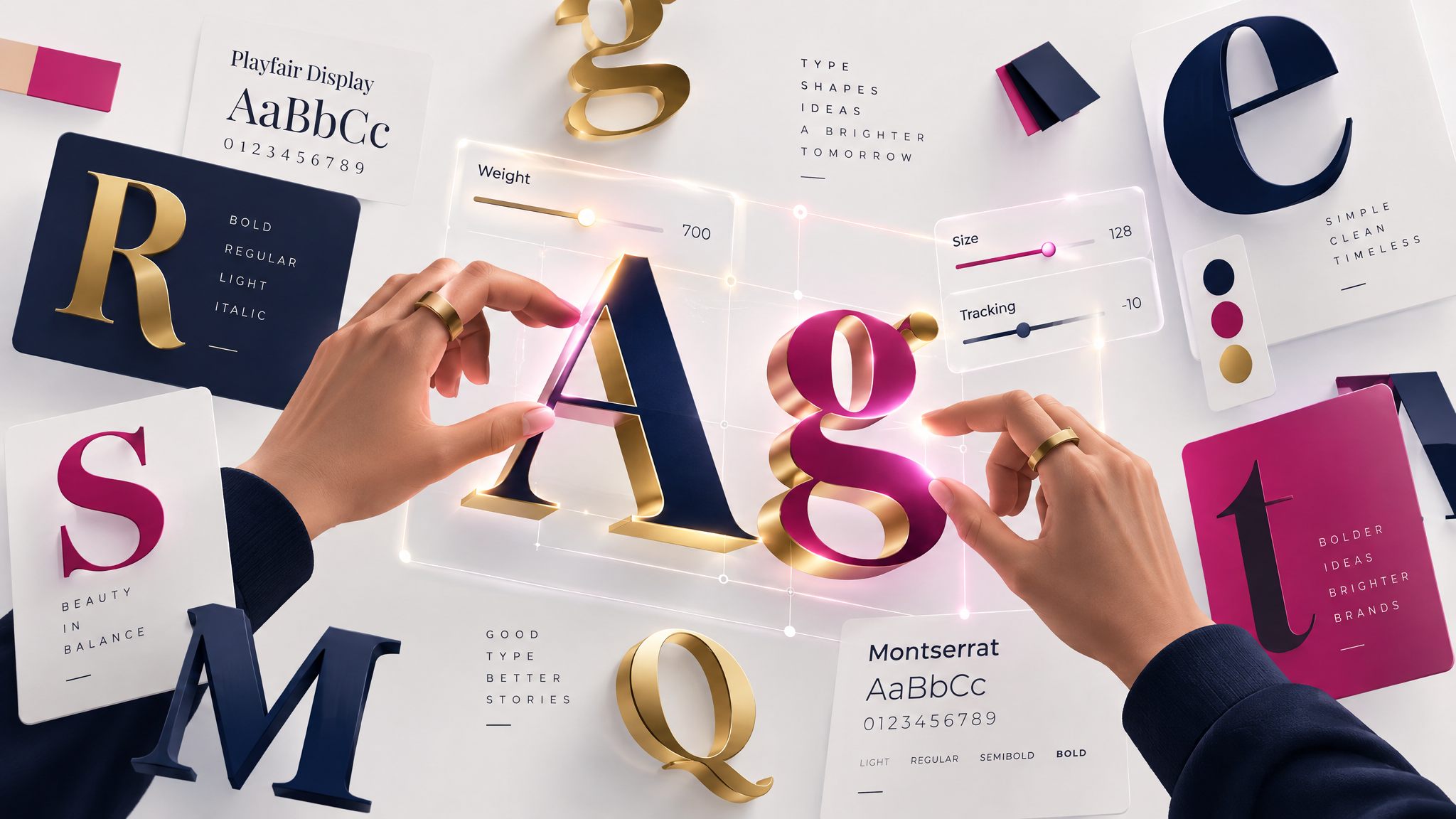
Typography is one of the most important — yet often overlooked — elements of web design. The fonts a website uses shape how content is read, how a brand feels, and how easily visitors can absorb information. Good web design typography goes beyond simply picking a font that looks nice; it involves understanding readability, hierarchy, and how type choices reflect a brand's personality. This guide covers the essentials of choosing the right fonts for your website.
Why Typography Matters
Typography affects readability, user experience, and brand perception all at once. Poorly chosen fonts can make content difficult to read, slow down page load times, or clash with a brand's overall identity. On the other hand, thoughtful web design typography enhances usability, keeps visitors engaged, and reinforces a professional, polished appearance.
Serif vs. Sans-Serif Fonts
Fonts generally fall into two broad categories: serif and sans-serif. Serif fonts have small decorative strokes at the ends of letters and are often associated with tradition, elegance, and authority — commonly used by editorial or luxury brands. Sans-serif fonts have clean, simple lines without these strokes, giving them a modern, minimal feel that's popular in tech, startups, and contemporary web design. Neither style is inherently better; the right choice depends on the brand's tone and target audience.
Choosing a Font Pairing
Most websites use two to three fonts: one for headings and one or two for body text. A common approach is pairing a distinctive, expressive font for headlines with a simple, highly readable font for body copy. This creates visual interest while maintaining readability for longer blocks of text. When pairing fonts, aim for contrast (so they don't look too similar) balanced with harmony (so they don't clash).
Readability and Font Size
Body text should generally be large enough to read comfortably without zooming — typically at least 16px for web content. Line height (the spacing between lines of text) and line length also affect readability; lines that are too long or too tightly spaced can strain the eyes. Prioritizing readability ensures visitors can comfortably consume content, especially on longer pages like blog posts or articles.
Establishing Hierarchy with Type
Typography plays a major role in establishing visual hierarchy. Larger, bolder headings signal importance, while smaller text indicates supporting information. Consistent use of heading levels (H1, H2, H3, etc.) not only improves readability but also helps with SEO, as search engines use heading structure to understand page content.
Variable Fonts and Modern Trends
Variable fonts — a newer font technology — allow a single font file to adjust weight, width, and style dynamically, giving designers more flexibility without loading multiple font files. This technology has made it easier to create expressive, responsive typography that adapts smoothly across different devices and screen sizes, a trend increasingly common in modern web design.
Performance Considerations
Fonts, especially custom or decorative ones, can impact page load speed if not implemented carefully. Limiting the number of font weights and styles used, and choosing web-optimized font formats, helps keep websites fast without sacrificing typographic quality.
Final Thoughts
Typography is far more than a stylistic choice — it's a functional design decision that shapes how effectively a website communicates. By understanding the basics of web design typography, including font pairing, readability, hierarchy, and performance, designers can create websites that are not only visually appealing but also clear, accessible, and easy to read for every visitor.